
Blog CTA Testing: A/B Test Calls to Action Without Hurting the Reader Experience
Semantic Summary
Idea: Blog CTA testing should help a reader take the next useful step, not interrupt the reason they opened the article.
Challenge: Teams often test button colour, copy, or placement without first matching the CTA to the article’s intent, setting a single hypothesis, or checking whether an apparent click gain creates lower-quality outcomes later.
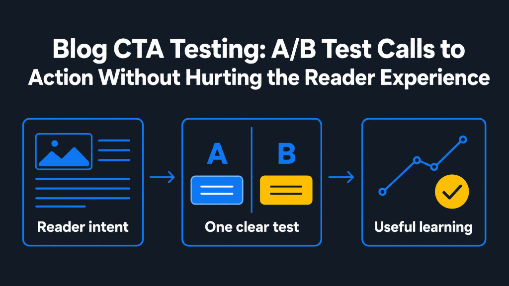
Summary: Start with the reader’s job, choose one CTA moment and one variable, run a fair comparison, measure both the primary action and guardrail signals, then use the learning to improve the next test.
Related Reads
- Creating BoFu Content That Actually Converts: The B2B Guide
- Content ROI: How to Measure What Actually Matters (and Prove It to Your CFO)
- Aligning Content Strategy with Product-Led Growth (PLG)
What Blog CTA Testing Is and What It Is Not
Blog CTA testing compares two versions of a call to action to learn which one better supports a defined next step for readers. A CTA, short for call to action, can be a button, a linked line of text, or a small content block that tells a reader what they can do next.
An A/B test compares two versions of a design or message to see how the difference affects user behaviour and outcomes.
In a blog post, the next step is rarely “buy now” by default. A reader may need a related guide, a product explanation, a template, a newsletter, a conversation, or time to continue learning. That is why a blog CTA should start with the article’s promise and the reader’s likely question, not with a generic button pattern.
A blog CTA is also different from a landing page CTA. A landing page exists to help someone evaluate one focused offer. A blog post exists to answer a question. A CTA can create a useful path from that answer to a relevant resource, but it should not make the article feel like a disguised sales page.
The point of testing is not to find the loudest CTA. It is to find a clear, honest, and timely prompt that helps the right reader continue. That principle protects reader experience while still creating a measurable conversion path.
Start With Reader Intent, Not a Button Variation
The most useful CTA test begins before the CTA exists. First decide what the reader came to learn, what they should understand by the end of the post, and which next action would genuinely help them progress.
Map the post to a realistic next action
An early-stage article may lead to a framework, glossary, or checklist. A comparison-style post may lead to a deeper use-case guide. A bottom-of-funnel article can reasonably point to a product walkthrough, a free trial, or a conversation. The offer should match the information already delivered in the post.
For example, a guide that explains how to diagnose a content problem can link to a related template that helps a team apply the method. It should not suddenly ask for a high-commitment action with no connection to the reader’s current task.
This is the same principle behind useful bottom-of-funnel content: the next step must be earned by the context.
Choose one primary CTA and an optional secondary CTA
Every blog post does not need the same conversion goal. Choose one primary CTA that represents the best next action for the majority of readers. If a secondary CTA is needed, give it a lower-commitment role, such as reading a related article instead of requesting a sales conversation.
This is not a rigid one-button rule. A long article may repeat the same primary CTA at sensible points, and a reader may benefit from one contextual text link before the final CTA button. The test is whether the options help a reader decide or make them stop and compare unrelated offers.
Define the reader-experience guardrail
A guardrail is a signal you watch to make sure an experiment does not create harm while improving the main metric. For blog CTA testing, guardrails can include abrupt page exits, poor mobile use, inaccessible contrast, misleading destination copy, repeat prompts that block reading, or a fall in meaningful engagement after the click.
Write the guardrail down before the test starts. That turns “do not be intrusive” from a vague preference into a decision rule the team can use when reading results.
Turn a CTA Idea Into a Testable Hypothesis
Use this table to move from a vague CTA optimization idea to a bounded experiment. One row is enough for a single test; do not turn every row into one simultaneous change.
| CTA test question | One change to test | Primary metric | Reader-experience guardrail |
| Does the offer match the article’s intent? | Supporting value statement | Qualified next-step action | No rise in rapid exits or negative feedback |
| Is the action clear? | CTA copy | Meaningful CTA click | The destination and outcome remain accurate |
| Does the CTA appear at the right moment? | Placement after a useful section | Click-through to the next resource | Reading flow is not blocked or obscured |
| Is the format easy to use? | Text link versus CTA button | Completed action | Mobile usability and accessibility remain intact |
Pick a Single Variable Worth Testing
Changing several things at once can produce a better-looking result, but it cannot tell you why performance changed. A fair test gives the team one useful learning at a time.
Test the offer and supporting context before decoration
The strongest early tests often concern relevance. Does the offer solve the question raised by the blog post? Does the short sentence before the CTA explain the value of the next resource? Does the landing page continue the same promise? These decisions usually matter more to reader experience than an isolated visual change.
Good test candidates include the type of offer, the supporting value statement, CTA copy, destination, placement, and format. A visual treatment can be worth testing when the offer and message are already clear, but colour alone is rarely the most useful first hypothesis.
Test CTA copy that makes the next step explicit
CTA copy should say what will happen after the click. “Use the content audit checklist” is more informative than “Learn more” when the destination is a checklist. “See the implementation guide” is clearer than “Get started” when the reader will open a guide, not create an account.
Specific copy also protects trust. It prevents a reader from expecting a template and arriving on a product page, or expecting a short resource and encountering a long form. A compelling CTA does not need to overpromise; it needs to describe the action and outcome accurately.
Test placement at a natural decision moment
There is no universal best place for every CTA. A top-of-page CTA may serve a returning reader who already knows the topic. An in-content CTA can work after a section answers an important question. A bottom-of-post CTA may suit readers who want the full explanation before deciding what to do next.
Place the CTA where the reader has enough information to recognise its value. Do not insert a prompt simply because a scroll depth marker appears. Content length, topic complexity, traffic source, and reader intent all affect what placement can work best.
Match the CTA type to the reader’s stage
Different CTAs serve different moments. A reader at the beginning of a topic may need a related post or a short checklist. A reader who has compared approaches may be ready to see an implementation guide.
A reader who has already identified a fit may reasonably choose a free trial, create an account, or submit a form. The CTA message should name that specific action instead of treating every blog visitor as if they are at the same buying stage.
Use this as a content decision, not a rigid CTA per page rule. A long guide can contain a main CTA near the bottom of the page and a secondary CTA that links to related posts where readers need a prerequisite.
The question is whether each call-to-action moves the reader forward. A red button, a larger design element, or a prompt at the top of the page will not compensate for an offer that does not fit the article.
Customization should come from evidence. If one content cluster serves several distinct audiences, create context-specific CTA copy only when the destination and action are genuinely different. Do not multiply CTAs simply to make every blog post look more active.
Use CTA examples as patterns, not scripts
Call to action examples can help a team see patterns, but they are not copy-and-paste answers. Ask what makes an effective CTA in the original context: the headline, the reader’s task, the promise before the CTA appears, and the destination after the click.
A great CTA for one page may be a poor direct CTA for another. Use examples to form a hypothesis, then test the version that fits your own readers.
Run a Fair Blog CTA Test
A useful A/B test has a clear control, one planned variation, a defined audience, and a decision rule set before results arrive. This keeps the experiment focused when the numbers become tempting to interpret too quickly.
Write the hypothesis before publishing the variation
Use a simple structure: “If we change this element for this reader context, then this primary action will improve because this is more relevant or clearer.” For example, a team may hypothesise that a specific CTA message will earn more qualified clicks because it names the resource a reader needs after completing the article.
A hypothesis is not a prediction that must win. It is a clear explanation of what the team is checking. If the result does not support it, the test has still narrowed the next optimization opportunity.
Keep the comparison clean
Use the original CTA as the control and one changed version as the variation. Keep the article, intended audience, and destination stable wherever possible. Avoid launching an unrelated campaign, rewriting the blog post, changing the offer, and changing the CTA button at the same time.
Public-sector guidance on A/B testing recommends defining the problem and hypothesis, creating a control and variation, splitting groups randomly, and comparing outcomes. It also notes that the appropriate sample and duration depend on traffic and the expected behaviour change. In practical terms, decide what a fair comparison requires before the test is live.
Set the metric and stop rule in advance
Choose one primary metric that reflects the intended next action. Depending on the CTA, that may be a meaningful click, a completed form submission, a resource view, or an account-start action. A click can be useful, but it is not always the final outcome that matters.
Set a run window and a review point based on the traffic the blog post normally receives. Do not use a universal duration rule. A low-traffic post may not produce enough evidence for a confident decision; a large traffic spike may behave differently from normal readers. If the test is inconclusive, revisit the hypothesis rather than forcing a winner.
Check traffic and implementation before the split
Before you run a test, check that the web page receives enough traffic to make the comparison worth the effort. Review normal website visitor volume, the source of that traffic, and whether the primary action can be measured reliably.
If a CTA leads to a form, confirm that form submissions, completed submissions, and the destination page can be distinguished from an accidental click.
Also test the original CTA and the variation on mobile. The CTA button must be easy to read, reachable by keyboard, clear about the destination, and visible without blocking the main content.
A technical implementation problem can make a promising CTA message appear weak, so keep a short quality-assurance record beside the experiment plan.
Measure More Than CTA Clicks
A higher click-through rate is useful only if the action still aligns with the reader’s need. A reader-first testing programme combines the primary conversion metric with quality signals that show what happens next.
Pair the primary metric with guardrail metrics
For a CTA that leads to a guide, the primary metric could be clicks to that guide. A guardrail may be rapid returns to the blog post, poor engagement on the destination, or a decline in the meaningful next action the guide was designed to support.
For a form CTA, watch completed submissions as well as form abandonment and the quality of the resulting request.
Keep guardrails proportionate. A small blog CTA test does not need a complex measurement system. It does need at least one way to catch a result that looks positive in clicks but weakens relevance, trust, accessibility, or downstream engagement.
Read the result in context
Ask whether the audience changed during the test. Readers from an email campaign, a search result, a social post, or a returning bookmark may respond differently to the same CTA. Check device mix, article topic, publication updates, and seasonal campaigns before treating a result as a permanent rule.
Conversion rate optimization, often shortened to CRO, means improving the proportion of people who complete a meaningful action. It is most useful when the team connects the action to a real content goal rather than reporting clicks in isolation.
For a broader approach to measurement, see Content ROI: How to Measure What Actually Matters.
Record the learning, including an inconclusive result
Keep a simple experiment record: the page or post, audience, hypothesis, control, variation, primary metric, guardrails, result, context, owner, and next action. This record prevents teams from repeating the same weak test months later and helps them spot patterns across a content cluster.
An inconclusive result is still useful. It may show that the changed CTA did not matter enough to justify a rollout, that the page lacks enough traffic, or that the hypothesis needs a more relevant variation.
Public guidance on experimentation also stresses that teams can revisit the goal and create a new variation when results are not decisive.
Decide whether the winning CTA deserves a rollout
When you run a test, compare the original CTA with the variation against the primary metric and the guardrails. A winning CTA is not simply the version that gets more clicks.
It is the version that improves the specific action the article needs while staying clear, easy to read, and relevant after the click. If the variation creates a weak downstream result, keep the original CTA or test a more useful change.
Keep a simple inventory of different CTAs across the content cluster. Note where every CTA appears, which CTA copy is used, and which pages receive enough traffic for a test.
This creates a practical list of optimization opportunities and supports an “always be testing” habit without making immediate action the only goal of every blog reader.
Common Blog CTA Testing Mistakes
The most damaging CTA testing mistake is treating a click as success when the CTA interrupts the article or sends the reader to an irrelevant next step. The following errors make results harder to trust and reader experience weaker.
| Mistake | Why it weakens the learning | Practical correction |
| Testing copy, colour, placement, and destination together | The team cannot tell what caused the result. | Change one meaningful variable per test. |
| Using a generic offer on every blog post | The CTA ignores different reader intents. | Match the offer to the article’s topic and stage. |
| Ending a test because early numbers look promising | The result may reflect unusual traffic or noise. | Use the agreed review point and record the context. |
| Measuring clicks only | A click can be accidental or low quality. | Track the intended next step and one guardrail. |
| Adding intrusive CTA patterns | Short-term attention can weaken trust or accessibility. | Prioritise clear, optional, usable CTA presentation. |
How Contadu Supports Evidence-Led CTA Decisions
Contadu can help teams connect article intent, topic coverage, reader questions, relevant next resources, and performance review before they test a CTA. That makes CTA testing a content decision rather than a disconnected page experiment.
For example, a team can review the purpose of a content cluster, identify which post already answers a reader’s question, and choose a related resource that offers a credible next step. It can then avoid sending every visitor to the same destination just because it is convenient. This supports the broader work of aligning content strategy with product-led growth.
Experiment findings also create a refresh opportunity. If a tested CTA reveals that readers need a different prerequisite guide, clearer framing, or a more helpful internal link, update the content system not only the button. Use the content refresh playbook to decide whether a page needs a small update, a rewrite, or a new supporting resource.
A Pre-Test Checklist for Blog CTAs
Before launching a CTA test, confirm that the experiment is useful to both the reader and the team.
- The article’s reader intent and primary next action are clear.
- The CTA destination continues the promise made in the blog post.
- One primary CTA and, if needed, one genuinely helpful secondary CTA have defined roles.
- The hypothesis states one change, an audience context, and a reason.
- The control and one variation are the only planned difference.
- The primary metric and at least one reader-experience guardrail are defined.
- The CTA button or link works on mobile, has clear text, and remains accessible.
- The team knows the planned review point, decision owner, and experiment record location.
FAQ
What is blog CTA testing?
Blog CTA testing is a controlled comparison of two calls to action in a blog post. The goal is to learn which version better supports a defined reader action, such as opening a relevant guide, using a template, or starting a product-related next step. A useful test also checks that the winning version does not weaken reader experience.
Why should blog CTAs be tested separately from landing page CTAs?
A blog reader often arrives to learn or solve a problem, while a landing page visitor is usually evaluating a defined offer. The CTA in a blog post should therefore fit the article’s topic and reading stage. A direct response pattern that works on a landing page may feel irrelevant or premature in educational content.
What is the best CTA element to test first?
Start with the element most likely to improve relevance: the offer, the supporting context, the CTA copy, or the destination. If these are already clear, test placement or format. Do not begin with a decorative change when the reader cannot yet understand why the next action is useful.
How long should a blog CTA test run?
The appropriate run time depends on normal traffic, the action being measured, and the difference the team needs to detect. Set a review point before launch rather than stopping as soon as one version appears ahead. If traffic is too limited for a reliable decision, record the learning and choose a higher-traffic page or a clearer hypothesis for the next test. If another marketing campaign changes the audience during the test, document it before treating the result as a reusable rule.
Can a blog post have more than one CTA?
Yes, especially when a long post has natural decision moments. Keep one CTA primary and make any secondary CTA clearly supportive, such as a related article for readers who need more context. Avoid presenting several unrelated offers that force readers to decide between competing actions. Not every blog post benefits from repeated CTAs, and not every CTA needs a separate test. Use a second prompt only when it supports a distinct reader need rather than competing for the same click.
What metrics should a team track besides CTA clicks?
Track the meaningful action after the click, such as a guide view, a completed form, or an account-start action. Add one or more guardrails, including destination-page engagement, rapid returns, mobile usability, accessibility issues, or feedback that indicates the CTA was misleading or disruptive.
What should a team do after a CTA test is inconclusive?
Do not force a winner. Review whether the post had enough traffic, whether the variation addressed a meaningful reader need, and whether outside changes affected the test. Record the result, refine the hypothesis, and run a better-focused follow-up when the team has a credible next idea.