
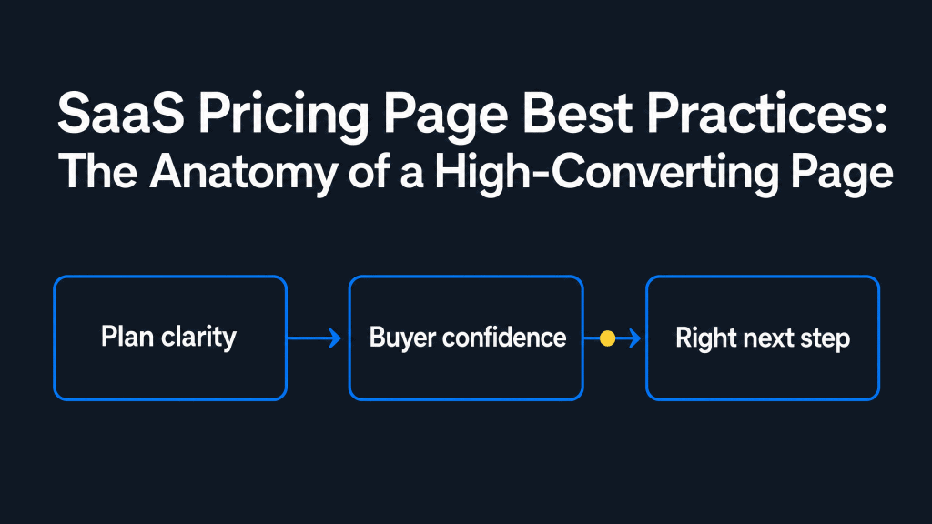
SaaS Pricing Page Best Practices: The Anatomy of a High-Converting Page
Semantic Summary
Idea: A SaaS pricing page should help a buyer understand the right plan, the value behind the price, and the next action without making them decode a complicated offer.
Challenge: Visitors arrive with different levels of product knowledge and can hesitate when plans, feature limits, billing terms, or purchase paths are unclear.
Summary: Build the page around decision clarity: explain who each plan is for, make meaningful differences easy to compare, answer likely objections, and measure where buyers get stuck.
Related Reads
- How to Create High-Converting Comparison Pages
- Content Marketing for SaaS
- How to Align Content Strategy with Product-Led Growth
Why a SaaS Pricing Page Is a Decision-Support Page
A SaaS pricing page is not simply a list of prices. It is a high-intent page that should help a prospective customer decide whether the product fits their situation, what commitment they are considering, and what to do next.
That matters because people reach a pricing page from different places. One visitor may arrive before they understand the product. Another may be comparing options after a product tour. A trial user may be checking what changes on a paid plan, while a larger team may be looking for a tailored buying route. The page has to be useful for all of them without trying to answer every question at once.
Start by separating two connected ideas. A pricing model is the way a business charges: per person, by usage, by product area, or through a fixed subscription, for example. A pricing page is the content and interface that explains that model. Strong SaaS pricing page design does not hide a confusing model behind polished cards. It makes the model understandable in the language buyers use.
For B2B SaaS teams, this page also connects product marketing, sales, customer education, and content strategy. It should reinforce the promise visitors saw elsewhere on the site, then provide enough detail for a confident next step. That is why the most effective pricing pages are built as buyer guidance, not as a final design task.
The Essential Anatomy of a High-Converting SaaS Pricing Page
A useful SaaS pricing page combines a short value reminder, understandable plans, clear price and billing terms, meaningful comparisons, evidence, and a realistic next action. The exact layout can vary, but a buyer should not have to hunt for those answers.
Start with a concise value reminder.
Before visitors study numbers, remind them what outcome the product helps them achieve. This should be brief. A pricing page does not need to repeat the entire homepage, but it should reconnect the price with the job a buyer wants done.
Use outcome-oriented language rather than feature inventory. “For teams that need a consistent approval process” is more helpful than a vague promise of “advanced capabilities.” If a product has several product areas, say which one the page covers before introducing the plans. This reduces the risk that a visitor compares prices without understanding the scope.
Make every pricing tier recognisable.
Each pricing tier should have a clear name, a one-line description of who it suits, a price or buying route, the billing period, and the limit or scope that changes the decision. The description is important. It converts a generic plan label into a practical choice.
There is no universal number of plans. Three pricing tiers can work well when they represent genuinely different needs, such as an individual, a growing team, and a larger organisation.
But a product with one simple purchase path may need fewer options. A product with several distinct product areas may need to group plans before asking a visitor to compare them. The aim is not to follow a rule; it is to avoid choices that look different but mean almost the same thing.
Show the comparison information that changes a decision.
Put the most decision-critical information close to each plan. That may include the usage allowance, main workflow, support level, control features, or access to a product area. Then offer a fuller pricing table when the product is complex enough that visitors need a side-by-side comparison.
A long feature grid can be useful, but only when it makes differences easier to see. If every row uses internal terminology or requires the visitor to move their eyes across a wide table repeatedly, it becomes work rather than guidance. Group features by buyer goal, use plain descriptions, and explain unfamiliar terms with concise supporting copy.
Make the next action match the plan.
Every pricing plan needs a call to action that matches the likely buying path. A self-serve plan might lead to account creation or a free trial. A plan with a customised scope may lead to a conversation. A usage-based pricing offer may first need an estimate or a short explanation of how metering works.
Do not treat all calls to action as interchangeable. “Get started” is not enough when a visitor needs to know whether they will create an account, enter payment details, speak with a person, or receive a tailored quote. A short sentence near the button can remove uncertainty without adding visual noise.
Match the Page Structure to Your Pricing Model.
An effective pricing page starts with the commercial logic, not with a row of pricing cards. Decide what a buyer is paying for, what changes as they grow, and which parts of that logic must be visible before they can assess the offer.
Explain the value metric in plain language.
A value metric is the unit that determines what a customer pays for or receives: people, projects, usage, locations, or another unit tied to the product. In a value-based pricing strategy, that unit should make sense alongside the outcome the buyer expects. If the unit is unfamiliar, explain it beside the price and include one realistic example of how it is counted.
Different SaaS pricing models need different explanations. A flat subscription may only need a clear scope. Tiered pricing needs visible differences between plans. Usage-based pricing needs a definition of the unit, an allowance, and the treatment of additional use. A hybrid offer may require a short introductory section before a visitor can compare plans confidently.
Before you create a pricing page, write a short internal brief: what buyers pay for, which pricing options serve distinct needs, and which pricing information changes the choice.
This makes the pricing page layout easier to review and prevents a common problem: presenting different plans that feel equivalent to the buyer. A clear pricing page should be reviewed whenever the SaaS product, packaging, or buyer language changes not only during a visual redesign.
Use examples as structure signals, not copy.
When reviewing pricing page examples, look for the information pattern rather than copying a page layout. Ask whether the page makes the price, intended user, plan difference, and next action clear within a quick scan.
The best pricing page for one business may not be the best fit for another; the right structure depends on the product, buying process, and decision-critical pricing information.
Buyer Questions Your Pricing Page Must Answer.
The page should make the core buying questions easy to answer before it asks for commitment. Use this table as an editorial check during a pricing-page review.
| Buyer question | Page element | What the visitor needs to see | Next action |
| Is this for a business like mine? | Plan description | Best-fit use case, team context, and scope | Open the matching plan |
| What will I actually pay? | Price block | Price, period, billing assumptions, and relevant limits | Choose the billing route |
| What changes between plans? | Comparison section | Decision-critical differences, not every technical detail | Compare plans |
| Can I trust the commitment? | Proof and objection support | Relevant evidence, policies, answers, and support route | Start, buy, or ask a question |
SaaS Pricing Page Best Practices That Reduce Hesitation
Better pricing pages reduce uncertainty; they do not rely on visual tricks or pressure. The following SaaS pricing page best practices are useful because they make the offer easier to understand and easier to assess in a buyer’s own context.
1. Publish clear prices and limits where the buying motion permits.
Transparent pricing means more than showing a number. The visitor should understand what the number covers, how often it is charged, whether it depends on usage, and which limits could change the final cost.
When annual billing is offered, show the billing commitment and the monthly equivalent clearly enough that it cannot be mistaken for a monthly charge.
Some B2B offers require a custom quote because the scope, controls, support, or deployment needs vary substantially. In that case, a “contact us” path can still be transparent.
Explain what makes the plan custom, which types of teams it is intended for, and what will happen after contact. Hiding all context does not make a complex price simpler; it simply moves the buyer’s uncertainty elsewhere.
2. Write plan descriptions for real buyer situations.
A good plan description helps a visitor recognise their situation. It may refer to a small team that needs a repeatable workflow, a growing department that needs more shared control, or a larger organisation that needs a tailored rollout. It should not depend on clever naming alone.
Review the words used in customer calls, onboarding questions, and support tickets. Those phrases often reveal how people describe their needs before they know your internal feature names.
Use that language in the “best for” line, then support it with a few concrete inclusions. This makes the pricing strategy feel connected to actual work rather than an abstract product ladder.
3. Highlight a recommended plan only when the recommendation is honest.
A highlighted plan can reduce decision effort when it genuinely fits the largest, best-defined group of visitors. It becomes counterproductive when it is only the plan a business most wants to sell. Visitors can sense the gap between a recommendation and their needs.
Before marking a plan as recommended, check whether the page explains why it suits that group. The relevant evidence might be the plan’s workflow coverage, typical usage range, or support model.
If different visitor groups have different needs, a simple plan-finder question or grouped pricing options may be more helpful than one universal badge.
4. Put proof where doubts appear.
Trust content belongs near the decision point when it answers a real concern. A short customer outcome, a clear security or privacy explanation, a support commitment, or an accessible policy link can help a buyer evaluate the commitment.
The best proof is specific to the concern, not a decorative collection of logos or superlatives.
Build the FAQ from actual objections rather than generic marketing questions. If visitors repeatedly ask how data is handled, what happens after a free trial, or whether a plan can be changed later, answer those questions in plain English.
The goal is not to remove every reason to pause. It is to remove avoidable ambiguity.
5. Design the mobile comparison deliberately.
A pricing page that works on a large screen can fail on a phone if the most important differences disappear into a sideways-scrolling grid. Mobile visitors still need to compare, but they need a different path to do it.
Test stacked plan cards with concise inclusions, a progressive “compare features” view, or a fixed set of decision-critical rows. Keep the selected billing option and call to action visible as visitors compare.
The question is simple: can a visitor on a small screen explain the difference between two pricing plans without pinching, zooming, or memorising a long list?
6. Give complex pricing an explanation layer.
Usage-based pricing, add-ons, and configurable offers are not inherently difficult. They become difficult when the page assumes the visitor already knows how the unit, allowance, or overage works. Define the metering unit in everyday terms and show a realistic usage scenario.
A calculator or estimator can be helpful when it makes assumptions visible. It should show what the estimate includes, what could change it, and whether the result is a guide or a final price.
A free plan or freemium pricing option also needs a clear boundary: explain what it enables, what limits apply, and the moment at which a team may need a paid plan.
Common Pricing Page Mistakes and the Practical Fix
The most common pricing-page problems are not usually visual. They are ambiguities: too many indistinguishable choices, hidden decision-critical details, and calls to action that do not match the buying journey.
| Mistake | Why it creates friction | Practical fix |
| Feature lists without context | Buyers cannot tell which difference matters to their work. | Add “best for” descriptions and decision-critical comparisons. |
| Too many plans on one screen | Choosing becomes a research task rather than a decision. | Group by product area or simplify the offer before presenting it. |
| Annual savings without a clear monthly equivalent | The actual commitment is hard to assess quickly. | State the billing period, equivalent price, and relevant conditions plainly. |
| A vague “contact sales” path | Visitors do not know whether they qualify or what happens next. | Explain the intended scope and the expected next step. |
| Desktop-only comparison design | Mobile visitors cannot compare plans with confidence. | Build and test a separate mobile comparison path. |
Another frequent mistake is mixing the page’s job with the job of every other bottom-of-funnel asset. A pricing page should be complete enough to support a decision, but it does not need to become a long product manual. Link to deeper use-case, implementation, comparison, and policy content when it will answer a specific next question.
The approach is similar to building high-converting comparison pages: make the primary decision easier, then offer detail without trapping the reader in it.
How to Measure Whether Your Pricing Page Is Working
Do not judge a pricing page by visits alone. Measure whether it helps qualified visitors move toward the next appropriate action, then pair those numbers with the questions and objections people raise.
Track the decision path, not only a top-line rate.
Start with plan-level actions. Review clicks on each plan’s call to action, completion after that click, demo or contact submissions, and interaction with comparison content.
Compare the patterns across device types and traffic sources, especially if a large share of visitors arrive from product pages, comparison content, or a trial environment.
Then look for disconnects. A plan may receive attention but few completed actions because the usage limit is unclear. A custom option may be ignored because the next step feels vague.
A free trial may start often but fail to reach activation because the page promised a different outcome than the onboarding flow delivers. This is the kind of content-performance question covered in Content ROI: How to Measure What Actually Matters.
Run focused tests while keeping the pricing logic stable.
Testing a page presentation is not the same as changing the underlying pricing model. Begin with one hypothesis based on observed behaviour or buyer feedback. For example, a team might test whether a clearer “best for” line improves the path to a relevant plan, or whether an explanation of a usage unit reduces pre-sales questions.
Keep the change focused enough that the result can teach you something. A new layout, different plan names, a revised price, a new promotion, and a different CTA all at once may change performance, but it will not tell you why.
Qualitative feedback from sales, support, and user research is essential here because the page is supposed to communicate, not merely collect clicks.
Set practical triggers for a pricing-page overhaul.
Revisit the page after a major packaging change, a shift in the target buyer, repeated questions about limits, growing mobile friction, or a clear mismatch between page language and sales conversations.
Set one owner for the update cycle. Pricing-page content decays when product, policy, or buyer language changes but the published explanation does not.
A regular review also keeps the page connected to product-led growth. When self-serve users and sales-assisted buyers need different information, the pricing path should acknowledge that difference rather than forcing everyone through the same vague call to action. For more on that connection, see How to Align Content Strategy with Product-Led Growth.
How Contadu Helps Turn Pricing-Page Questions into Better Content
A pricing page rarely works alone. It performs better when the rest of the site helps people arrive with the right context and gives them a useful next step when they need more detail.
Contadu can help content teams identify the questions, comparison themes, and buyer objections that should shape this supporting content. The practical task is to map each high-intent question to the right asset: a use-case page, a comparison page, a product explanation, an onboarding guide, or a bottom-of-funnel article.
That creates a clearer journey without trying to place every answer on the pricing page itself.
Use the page as a source of content intelligence, too. Repeated pre-sales questions can inform new articles, clearer internal links, or revisions to plan descriptions.
Pair this with a focused bottom-of-funnel content strategy so that buyers who are not ready to choose a plan still find a useful, credible path forward.
A Pre-Publish SaaS Pricing Page Checklist
Before publishing or redesigning a pricing page, use this short check. If the team cannot answer one of these points clearly, a visitor may not be able to either.
- Each pricing plan has a clear best-fit description, price or buying route, billing period, and relevant limit or scope.
- The page explains the differences that affect a buying decision before it lists secondary details.
- Any annual offer, discount, add-on, or usage rule is explained without requiring a visitor to infer the final commitment.
- The recommended plan, if used, is backed by a genuine fit rationale.
- Each call to action describes an appropriate next step for that plan.
- Evidence, policies, and FAQs answer real objections near the point of decision.
- The comparison path works on mobile, not only on a large screen.
- The team tracks plan-level actions, recurring questions, and a defined review trigger.
FAQ
What should a SaaS pricing page include?
At minimum, include a short value reminder, clear pricing plans, the billing period, meaningful limits or scope, plan descriptions that explain who each option is for, and a next action. Add comparison detail, proof, and FAQs when they answer real buyer questions. The page should make the purchase path understandable, not merely display prices.
How many pricing tiers should a SaaS pricing page display?
Show only as many pricing tiers as buyers can meaningfully distinguish. Three can be a practical starting point when the needs are clearly different, but it is not a rule. If you have many offers, group them by product area or buyer journey so visitors compare a relevant set rather than every possible option.
Should SaaS companies show prices publicly?
Public pricing works best when a visitor can understand the scope and the final commitment from the information provided. When a plan truly requires a tailored quote, explain why it is customised, who it is for, and what happens after the visitor contacts you. Transparent pricing is about clear expectations, not only a visible number.
How can visitors compare SaaS pricing plans without reading a long feature list?
Start with the differences that change the decision: intended user, workflow coverage, usage allowance, control level, and support route. Use a short plan summary first, then let visitors open a detailed pricing table if they need it. Group complex features by buyer goal and define unfamiliar terms in plain language.
Should a pricing page include a free trial, a demo request, or both?
Use the path that reflects how the product is actually bought. A free trial suits a self-serve journey when a person can reach meaningful value independently; a demo suits a complex or sales-assisted decision. Both can coexist if the page clearly signals which path fits which visitor and explains what each action involves.
How can a SaaS pricing page work well on mobile?
Do not simply shrink a desktop pricing table. Use stacked plans with concise, decision-critical details, offer a deliberate comparison view, and keep billing controls and the next action easy to access. Test whether a person can explain the difference between plans on a small screen without horizontal scrolling through a dense grid.
How do you know when it is time to redesign a SaaS pricing page?
Redesign when the product packaging changes, buyer questions repeat, mobile visitors struggle to compare, or sales conversations reveal that the page is creating a wrong expectation. Treat these signals as content evidence, then test one focused change at a time. A pricing-page redesign should improve decision clarity, not just refresh the visual style.