
Microcopy Best Practices: Small Words That Build Trust in Content Marketing

Semantic Summary
Idea: Microcopy is the small text around an action—such as a button label, form instruction, error message, or confirmation—that tells people what will happen and how to proceed.
Challenge: Tiny phrases are often written last, without the reader’s context, accessibility needs, or likely hesitation in mind. This can turn a useful content journey into a confusing interaction.
Summary: Treat microcopy as a governed content surface: make one clear promise, use plain language, explain meaningful requirements before the action, help people recover when something goes wrong, and test against real reader behaviour.
Related Reads
- Blog CTA Testing: A/B Test Calls to Action Without Hurting the Reader Experience
- Content Conversion Paths: Designing the Route From Education to Demo
- Help Center SEO: How to Write Documentation That Helps Users Succeed
What Microcopy Is and What It Is Not
Microcopy is the short, functional text that guides a person through an interface or content interaction. It includes a button label, a form instruction, a link, a tooltip, a confirmation, an error message, an empty state, and the words on a 404 page. It is small in length, but it can have a large effect on whether a reader understands a next step.
UX writing shapes language across digital products. Microcopy, also called UX microcopy or UX copy, is part of UX writing and UX design: tiny interface text that serves user needs at a decision point. Marketing copy persuades; microcopy helps users understand and complete the desired action. A content path needs both.
Think of microcopy as the voice a person hears when they pause. A visitor may understand your article but still hesitate over “Start free trial,” “Submit,” or a request for personal information. Good microcopy answers the quiet question behind that pause: What happens if I do this? What do you need from me? Can I fix this if I make a mistake?
That is why this small interface text belongs in content marketing conversations. An article, landing page, content offer, form, and confirmation page are one reader experience, not separate pieces of content handed off between teams.
The Psychology Behind Effective Microcopy
Effective microcopy reduces avoidable uncertainty. It helps a real user predict what will happen, understand the value of an action, and recover without blame when something goes wrong.
Predictability reduces hesitation
People are more likely to act when the result of an action is clear. A button label such as “Get the checklist” tells a reader what they receive. “Submit” only describes a technical act. The first option makes the outcome visible before the click; the second asks the person to infer it from the surrounding page.
This does not mean every CTA must be long. It means the right words must answer the reader’s immediate question. A concise label can be specific when the supporting sentence already explains the value.
A short, precise link is often more helpful than a creative phrase that works only after someone has studied the design.
Cognitive load is a writing problem too.
Cognitive load means the mental effort needed to understand or complete a task. In microcopy, unnecessary effort often comes from unfamiliar jargon, two ideas forced into one sentence, or instructions shown after a reader needs them.
Effective microcopy helps users understand the current decision without decoding the interface.
Use one idea per message. If a form field needs a particular format, say so where the person can see it before entering anything. If a choice has a consequence, explain the consequence.
Concise writing does not mean removing detail that someone needs to succeed; it means removing the detail that does not help them act now.
Trust comes from transparent language
Readers notice ambiguity around checkout, privacy, money, cancellation, account access, and free trials. In these moments, microcopy should feel calm and direct.
Explain why you request a detail, whether a trial changes automatically, what an email contains, or when a person can expect a reply. Do not bury a meaningful condition in decorative wording.
Voice and tone still matter. A friendly sentence can make an interface more human. But when the reader needs to make an informed choice, clarity is more valuable than cleverness. Put the plain message first; add personality only if it does not weaken the message.
Turn a Quiet Question Into a Clear Answer
Before you write microcopy, identify the question a reader is silently asking at that exact point. The table gives generic microcopy examples that can be adapted to a relevant content context.
| Reader’s quiet question | Weak microcopy | Clearer microcopy | Why it helps |
| What happens when I click? | Submit | Get the checklist | Names the immediate outcome. |
| Why do you need this detail? | Company size | Company size — helps us tailor the guide | Explains the reason for the form field. |
| What went wrong? | Error | Enter a work email address | Identifies the problem and the next action. |
| Did the action work? | Done | Your guide is on its way | Confirms the result and sets expectations. |
Microcopy Best Practices for Common Content Moments
Write the words that let a person complete the current task, not the words that sound most clever in isolation. The following practices focus on the places where content and action meet.
Buttons, links, and calls to action
A button label should name the action or outcome. “Compare plans,” “Read the case study,” “Estimate the impact,” and “Request a demo” are clearer than “Learn more” when the destination matters. Microcopy examples work only in context: review the landing page promise, form, button label, and confirmation together.
For linked text in articles and landing pages, write the destination into the link. “Read our guide to bottom-of-funnel content” helps readers decide whether it is relevant. Three “Read more” links are less useful outside their visual context.
Test button labels where there is a genuine uncertainty about the reader action, but do not copy a winning label into a different journey. The CTA, destination, and reader’s next stage need to work together.
For controlled experiments, see Blog CTA Testing: A/B Test Calls to Action Without Hurting the Reader Experience.
Forms, labels, helper text, and placeholders
A label identifies the form field. Helper text explains an unusual requirement, expected data format, or reason for a request. Placeholder text is the faded example that appears inside an empty field. These elements are not interchangeable.
W3C guidance says that labels and instructions help users know what information to enter, and that instructions should give enough information without cluttering the page. If a field asks for something non-obvious, add a short explanation before the reader acts. “Team size used to tailor the resource” is more respectful than a field that simply demands a number.
Do not use placeholder text as the only label. It disappears as the user types and is not a replacement for a visible, associated form label. Use placeholders for an optional example of format, such as an example email address, not for information a person must remember while completing the form.
Error messages and recovery
An error message should do four things: identify the issue, name the affected field, explain how to fix it, and keep the tone calm. “Enter a work email address, such as name@company.com” is more useful than “Invalid entry.” It tells users what went wrong, gives a concrete next step, and helps users feel able to recover.
When an input error is detected, W3C guidance requires the affected item and the error to be identified in text. A red outline or warning icon may support the message, but colour alone is not enough.
Avoid blame. “This date needs the format DD/MM/YYYY” focuses on the correction; “You entered this incorrectly” makes the interface sound accusatory without adding value.
Do not make readers repeat the same failed action without help. If something went wrong on submission, preserve valid responses where possible and bring attention to the first correction needed. That turns an error message into a recovery path instead of a dead end.
Confirmations, empty states, and 404 pages
Confirmation microcopy tells readers that an action worked and what happens next. It can confirm a newsletter subscription, explain when a guide will arrive, or state that a team will respond within a stated period. “Thank you” is polite, but it is stronger when paired with a useful expectation.
An empty state should explain the current condition and offer a sensible next action. If a search returns nothing, say so plainly and suggest a related topic, filter, or help route. If an account has no saved items, explain how a user can add one. A 404 page should state that the page was not found and direct the visitor toward a search, hub, or relevant guide.
Humour can work on a low-risk page, but it should never replace the basic message. A reader who cannot find a resource needs to understand the problem and their next step before they encounter a joke.
Tooltips and secondary explanation
A tooltip is a short piece of help attached to a UI element. Effective UX microcopy gives users optional context, such as an explanation of a technical setting or unfamiliar term. It should make it clear to the user what happens next, not make users guess. Do not place essential requirements or pricing conditions there.
Before adding tooltips, ask whether the interface or supporting content can be made clearer instead. A long list of tooltips may signal that the form, label, or page structure needs work. Keep the microcopy concise, but make the necessary information easy to find again.
Build Microcopy Into the Content Workflow
Better interface copy comes from collaboration and revision, not a last-minute copy edit. Assign ownership for the wording around high-value reader actions just as you would for the long-form content that leads to them.
Start with the reader question and action
Use a brief that records the reader, their task, their likely hesitation, the next action, and the expected result. It gives the writer context a screenshot cannot.
For a downloadable guide, the surrounding marketing copy explains value while form microcopy clarifies access and email use at the point of exchange.
Set a voice-and-tone boundary
Write a short voice-and-tone rule for recurring interface moments. Decide how formal the language should be, whether contractions fit the audience, how you refer to features, and which phrases are not allowed.
Most importantly, identify moments where plain language overrides brand personality: payments, privacy, cancellation, account recovery, security, and errors.
This prevents microcopy from drifting as many contributors edit content. It also stops a distinctive campaign phrase from becoming the only explanation of an important action. Consistency is not about making every message sound identical; it is about making the meaning dependable.
Review with the people who own the experience
Content marketers should not review this wording alone. Bring in product managers, UX designers, support, development, and accessibility or privacy reviewers when needed.
Support teams identify repeated questions; product teams verify what the interface does; accessibility reviewers flag messages that depend on location, colour, or an icon.
Maintain a simple approved list of recurring terms. If the interface calls something a “workspace,” the guide, landing page, form, and support article should not alternate between “account,” “portal,” and “dashboard” without a real difference in meaning.
Make Microcopy Inclusive and Accessible
Accessible interface text states the essential message in clear text, at the right moment, in a form people can understand and use. It improves the overall user experience because the same clarity helps everyone, not only people using assistive technology.
Give labels and instructions before a problem occurs
Put important instructions close to the relevant form field and before the reader needs to act. State whether an input is required, what format it needs, and why a less-obvious detail is necessary.
W3C notes that labels and instructions can prevent incomplete or incorrect submissions, but warns that excessive instruction can be as harmful as too little.
Review the journey in order: label, instruction, form field, CTA, error message, and confirmation. If a person discovers an important requirement only after pressing the button, the interface has shifted work from guidance to recovery.
Do not make colour or icons carry the whole message
A coloured border can attract attention, and an icon can reinforce a status. Neither should be the only way a reader learns what happened. Use plain text that names the issue or status. This matters for people who use screen readers, zoomed interfaces, high-contrast settings, or simply miss a small visual signal.
Read each error message and confirmation without its visual styling. Would a person understand the state, the problem, and the next step? If not, the wording needs revision before the design is treated as complete.
Test the words in the real interaction
These messages may sound fine in a document and fail in the live interface. Check them at the actual size, on mobile, in keyboard order, and when translated or filled with real data. Test blank fields, wrong formats, zero search results, and empty states.
Text that guide users should be visible when needed, not only when a person has guessed to hover or open a tooltip. If an instruction is essential to complete an action, make it available in the normal task flow.
Measure and Improve Microcopy Without Chasing Clicks
Measure this wording by whether it helps the intended person complete a meaningful action with less confusion. A raw click increase can be useful evidence, but it is not enough on its own to show a better user experience.
Use qualitative signals first
Start with the words people use when they are confused. Support tickets, search queries, form-abandonment comments, usability observations, sales conversations, and feedback from new users can expose a gap that analytics alone cannot explain. If readers ask what happens after a form, the confirmation or helper text may be weak. If they repeatedly choose the wrong option, the label or tooltip may be unclear.
Pair completion with guardrail metrics
Track a meaningful completion rate, such as a successfully submitted form, a completed onboarding step, or a qualified request. Then pair it with guardrails: increased support need, accidental choices, rapid reversals, invalid submissions, or lower-quality responses. This helps teams avoid optimizing a button label that attracts more clicks but creates more confusion later.
A content conversion path needs the same discipline. A useful internal link can move a reader from education to evaluation; a vague one can produce clicks without helping anyone reach the right next stage.
See Content Conversion Paths: Designing the Route From Education to Demo for the wider route around the individual CTA.
Test one change with a clear hypothesis
Write a behaviour-based hypothesis before changing the wording. For example: “If we replace ‘Submit’ with ‘Get the guide,’ readers who want the resource will better understand the outcome and complete the form at a higher rate without increasing low-quality submissions.” This is specific enough to test and reject if the evidence disagrees.
Change one meaningful element at a time, keep a simple decision log, and revisit high-traffic interactions after a content refresh or product change. Use the findings to update approved patterns rather than treating each page as a separate experiment.
Common Microcopy Mistakes
Most interface-copy problems are not failures of creativity. They are failures to give a reader the information needed to act with confidence.
| Mistake | Why it creates friction | Better approach |
| Writing for the brand instead of the current task | The reader cannot predict the outcome. | State the action and immediate result. |
| Using a placeholder as the only label | The meaning disappears during entry. | Keep a visible, associated label. |
| Saying only “Something went wrong” | The reader cannot recover. | Name the issue and explain the correction. |
| Adding personality to a high-risk moment | Important details become ambiguous. | Put the plain message first, then add restrained tone if useful. |
| Repeating different names for the same feature | People are unsure whether terms mean the same thing. | Use one approved term consistently. |
| Declaring a new CTA “better” after a click gain alone | A click may not create a useful outcome. | Check task completion and downstream quality. |
How Contadu Helps Teams Govern Microcopy
Contadu can support this content work by helping teams research reader language, identify gaps, build clearer briefs, maintain terminology consistency, and plan internal links that lead to useful next steps. The goal is not to add more prompts. It is to help people move through a content experience without unnecessary uncertainty.
Content intelligence can reveal which questions appear in search, which articles need stronger bridges to evaluation content, and where a high-value page may need clearer instructions. A consistent brief connects long-form marketing content with the interface copy that turns understanding into action.
This is especially useful when content supports a decision over several touchpoints.
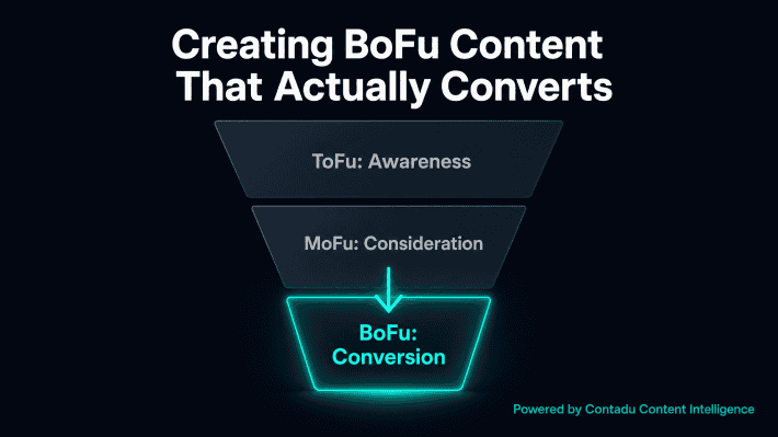
Pair reader-first interface language with relevant bottom-of-funnel evidence, as described in Creating BoFu Content That Actually Converts, then use meaningful outcomes not surface-level clicks to review its contribution to content performance.
Pre-Publish Microcopy Checklist
Use this checklist before publishing a new content interaction or revising an existing one.
- The reader task and likely hesitation are written down.
- Each button label and link states the action or outcome clearly.
- The CTA and destination make the same promise.
- Every form field has a visible label, and helper text explains only what is necessary.
- Placeholder text does not carry essential instructions by itself.
- Error text names the issue and gives a constructive correction.
- Confirmation text says what happened and what comes next.
- Important messages are understandable without colour, icons, or visual context alone.
- Terms match the product, help center, and content terminology.
- An owner, measurement plan, and review date are assigned.
FAQ
What is microcopy?
Microcopy is the short text that helps users understand and complete a specific action. It appears in button labels, links, forms, helper text, error messages, tooltips, confirmations, empty states, and other interface moments. Good microcopy is clear, useful, and relevant to the exact point where a person sees it.
What is the difference between microcopy and UX writing?
UX writing is the broader practice of writing for a user experience across a digital product or service. Microcopy is a subset of UX writing: the small, functional messages that guide a person through one action or decision. A UX writer may shape an entire onboarding flow, while microcopy includes the labels and feedback within it.
What is the difference between microcopy and marketing copy?
Marketing copy helps people understand the value of an offer and decide whether it matters to them. Microcopy supports the immediate interaction after or alongside that message. Marketing copy may explain why a guide is worth downloading; the form microcopy explains what information is required and what happens after submission.
What makes microcopy effective?
Effective microcopy is specific, concise, and written for the reader’s current task. It uses familiar language, states what will happen, gives necessary context before an action, and makes recovery possible if an error occurs. The best microcopy supports usability first and brand voice second when the two are in tension.
How should a team write a good error message?
A good error message identifies the affected field, explains what is wrong, and tells the person how to fix it. Use plain, non-blaming language and do not rely on a colour change or an icon alone. “Enter a date in DD/MM/YYYY format” is clearer than a generic alert because it gives the correction immediately.
Is placeholder text enough to label a form field?
No. Placeholder text can show an optional example of format, but it disappears during entry and is not a replacement for a visible label. Keep the label available, then use helper text or a placeholder only when it adds useful clarification.
How can a content team measure whether microcopy is working?
Measure a meaningful task outcome, such as successful form completion, a qualified request, or a completed onboarding action. Pair that result with qualitative signals such as support questions, usability observations, and reader feedback, then use guardrail metrics to make sure more clicks do not create more confusion. Test one change at a time and record the result for future content decisions.